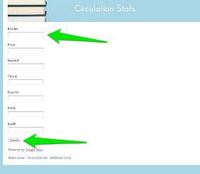
Step one to making a data board ... a bar graph of checkouts by grade level. You will need your monthly statistics (however you might get those ... can't really help you there because all I've ever worked with is SIRSI and I still call for help on setting up the reports!).
I used Google because I could enter my data here. Isn't that nice and clean and not scary?

You do have to have an account with Google for this to work. If you use gmail you've already go the access. If you don't ... maybe think about signing up? ;]
Of course when you go to the link you will see something that looks more like this. And I just realized I forgot to get a screen shot of one earlier step. Click on "File" and "Make a copy" first!
Enter your numbers. Hit Submit! See how the spreadsheet is still there?
So now go back to your spreadsheet. Click and highlight on the B column rows 1 & 2 and hold it over to the H column 1 & 2 (or I or J if you add PreK or Parents/Community Members).
Once you have those highlighted click on the little graph icon here.
This window will pup up. Choose the bar graph for this particular exercise. (If you are a math genius and you think up good uses for the other ones? PLEASE SHARE! Do you even know how long it took me to think through and decide "which kind of graph for what kind of data"?
Then click on "Insert."
Now see that little arrow? Click on that and choose "Move to own sheet." That might just be my preference but I preferred to not have the spreadsheet behind me. Then click on "Advanced Edit."
Then I choose to "Save Image."
If you want to print it bigger than a regular 8X11 there are all sorts of sites online to enlarge and "tile" the printing (ie each page will be like a fourth of the image and you tape it together). Poke around and you should find one that you can reach past your school filter.
Is this helpful at all? You know this is as much "If I can explain it to someone else I'll truly have mastered it" as anything. NO EXPERT HERE! ;]
Give me some time and I'll work up some other ones. Maybe ... a pie graph showing the percentages of total checkouts from Easy, Fiction, and Dewey? And maybe a line graph showing how busy the library is on different days (or hours of the day)? I did a pictograph of my usual tasks during the day ... but that was in Graph Club. And it was almost a total guess because my ability to keep track of hours spent in a week is not necessarily great.
I LEAVE YOU WITH THIS ... DON'T BECOME A SLAVE TO DATA GATHERING. IT'S SO NOT WORTH THAT. And stats can be manipulated and so only tell a part of the story. But a little info can be a helpful thing!

Here's my first post on a data board.


I usually just export from Destiny to Excel, but I think I like the looks of those graphs in Google better. I'm going to try it out next month! I used a bar graph for grade level data also. I think it's the best option.
ReplyDeleteBravo! Cause for all of my posturing about being tech savvy Excel gives me the heebie jeebies. Well. Just not a math wizard. But l am more and more interested in infographics and of course there is the ever present fascination with data ... so I'm learning. I think it would be fun to use the forms to get students answering questions about reading and research ideas/preferences and showing THAT.
DeleteI am curious about the other things you have hanging on your library numbers board. What are the picture and pie charts representing? I tried to make your picture bigger but couldn't see.
ReplyDeleteLove the idea and I am going to do something similar.
Thanks for sharing.
I did a post ... goodness. I guess it was just yesterday. For now the pie graph is checkouts by area. I think that will change, though. And then I also have a pictograph of VERY general ideas of how myself and my assistant spend out time at school. That was done in Graph Club. Will have to think of another way to do it. Then just the Follett reports. I want to get more student/staff info for the board but I'm still thinking through that data collection. Favorite genres, maybe a grade a month reporting on the number of pages read in an average week? Still thinking. This is a new work in progress. Started it the end of last year.
DeleteGot any ideas? PLEASE SHARE! ;] I love groupthink. Makes everything better.